February 23, 2012

2002 Michigan State Spartans

2002
Michigan State Spartans
B1G


Helmet:  A-
Home Jersey: B-
Away Jersey: B-
Pants: A

Final Verdict:

Good Riddance

This is an odd little number from recent MSU history. While this may not be the worst uniform the Spartans have ever had, it is the most unusual and bland. I get that they were trying to do something unique, but its rather uninspiring. The helmet is fine, other than the "S". It has always been my understanding that the "S" was the academic logo and the spartan helmet was the athletic logo. The numbers are fine, but they should be on the sleeves. They obviously left out the numbers for this strange piping. I know I have seen that design before, not on a football uniform, but I don't recall where. It just doesn't look right, kinda makes the arms look puffy. In addition, the "State" on the uniform is kinda lackluster. Tons of schools have "State", this should be unique. Not much to say about the pants, they are fine as is. All in all, Michigan State has one of the best uniform histories, but this is not one of the high points. Thankfully this uniform only stayed for one season then left like Bobby Williams.

February 21, 2012

2001 San Jose State Spartans

2001
San Jose State Spartans
WAC


Helmet:  A-
Home Jersey: F
Away Jersey: B-
Pants: F (black), A (white)

Final Verdict:

Good Riddance

Welcome to my first "Retro Review". This is where I take a specific uniform set from the past and do a review of it. Since the uniform is typically no longer around, the gradeing scale is now: "Good Riddance" or "Should have left well enough alone". Basically the former meaning I am glad they got rid of it and the latter being they should have kept it.

I really feel bad for San Jose State sometimes. Not only are they the only FBS team in California with no respect, but they play in an area dominated by the Raider, 49ers, Golden Bears, and Cardinal, and continue to get buried each year. I just want to see these guys be competitive for once. Or at the very least, have good uniforms. This should be filed under the "what were they thinking" category. I think this is an early example of BFBS before it became popular. Not only does black consume the uniform as the symbiote consumed Peter Parker, but it makes the team look bush league. Lets start from the top. The helmet logo is great and a year before these uniforms they had their best helmet, with a yellow facemask. Here, however, its black and it really darkens the color of the helmet. The yellow numbers are OK, but what is that stripe they have? I can see it better on the away uniforms, but I can't tell what it is suppose to look like. At least the white uniform had an absents of black and looks rather decent. And whats up with the "S" and the "E" spelling both "San Jose" and "State"? I mean I like that they have it written there, and yes I understand that "San Jose State" can be a bit wordy for a uniform, but its just so weird, hard to focus your eyes kinda. I'll grant its unique, just not very good. Black pants? Nope. And really adding the blue and yellow stripes did not help. The only good thing about this uniform is that the away uniform looked good. Granted the strip on the side made no sense, but it look descent. I don't know what compelled SJSU to do this, but I am glad it didn't last long. But ever since this, it seems SJSU is still struggling to find a descent uniform. Its one thing to be a bad team or have a bad uniform, but both is just a crime.

February 13, 2012

2011 Florida State Seminoles

2011
Florida State Seminoles
ACC


Helmet: A+
Home Jersey: A
Away Jersey: A
Pants: A+

Final Verdict: 

As Is

Frankly, I don't have much to say. The FSU uniforms are 99% perfect. Why 99%? Well first I will say that the helmet itself is perfect, perhaps the top five in college football helmets. The tomahawks for helmet stickers is great. The pants, also perfect. They don't need any stripes or anything, just the chief on the hip. I love the cuffs of the neck and sleeves have the feather print, very unique. Numbers are classy and stand out well, and there are even shoulder numbers. Now I appreciate that FSU added the "FSU" text to their uniforms, but where I have a problem is; FSU means more than just Florida State. Usually when I read FSU, I think of Fresno State, but that abbreviation is FS, which is commonly a secondary logo for FSU (you see the confusion). So I think that the FSU is a bit unclear for anyone outside of Florida, myself included. Really, it should be Florida State spelled out or Seminoles. And I take exception to Seminoles being written out because Seminoles is in recognition of a proud people and I have no problem with that name being there over the Florida State name. And of course the Nike logo is too big and predominate, and the NCAA triangle is there, but not counting those, this is a uniform that needs to stay around forever.

February 7, 2012

2011 Memphis Tigers

2011
Memphis Tigers
C-USA


Helmet: B
Home Jersey: A
Away Jersey: A
Pants: A (grey) A- (white)

Final Verdict: 

As Is

In light of the fact that Memphis will be moving to the Big East, I thought it only right to comment about their uniforms. I was not aware until recently that Memphis had new uniforms, and they are an improvement over last year's. The helmet is still the same. Of course, I don't like the black face mask, but more importantly, the logo blends into the helmet. Its a good logo, but since most of it is blue on a blue helmet its hard to really see it. The white outline helps, but not much. The jersey style is that of the current (2011) Miami uniform. The "bars" (I guess you would call them) add much needed color to the away uniform and the grey on the home makes it balanced. The numbers with the black outlines are good, makes them pop and easy to read. I don't get why the plain "M" is on the chest. Frankly it looks like the Montana State helmet logo. You would think that the chest would either say "Memphis" or have the "M" with the tiger, like on the helmet. And the C-USA patch is boring. I remember a time, back when Louisville was in C-USA, that all teams had "C-USA" written on the uniforms, kinda makes sense to keep it that way. I just don't know what people making uniforms think I guess. In any case, the pants are great. The grey ones I like and I am glad they did not go with all all blue uniform. As I have said before, I like the team name being written on the pants, but I am curious as to why the white pants have "Memphis" in grey and not blue, its so hard to read. Frankly I always enjoyed this Memphis uniform, but for what they have, its good, its simple, its clean, and it should stay for a few years.

February 6, 2012

2011 Idaho Vandals

2011
Idaho Vandals
WAC


Helmet: A- (standard), A- (alternate)
Home Jersey: A+
Away Jersey: B+
Pants: A+ (gold), A (black)

Final Verdict: 
As Is

This is the example to which Vanderbilt needs to look at for their uniforms. Idaho is a very simple black and gold. And frankly those two colors together look good, but teams like Vanderbilt can mess it up sometime, not in the the case of Idaho as a whole. The helmets are great. Simple with black face mask and gold shell. I gave it an A- simply because I am still a bit unsure about the logo. Same with the alternate. I don't think that Idaho has a unifying logo to put up there. Teams like Miami and Texas have an iconic logo that works on their helmets. Idaho tried two logos this year and neither really stand out as iconic, hence the minus. I will also note that I did not review the American flag logo, simply because it was a one time thing and nothing really special (American flag logos on helmets in general). Home jerseys, perfect. Sleeve numbers, "Idaho" on the front, gold numbers with white outlines, player names, and the "WAC" logo at a good size and it predominate. The away jerseys, that's another story. I mean I like the use of gold on the shoulders, but they don't match with the home jerseys. I don't like, nor understand, why they have two different uniform styles for the home and away. So it bothers me on that level. Plus, the "V" logo is on the collar for the away jerseys, but the "I" logo for the home. Someone needs to make up their mind here. And I also don't understand why the "WAC" logo has a box around it. Gold pants, perfect. Black pants? Well... I don't get the strip. Typically that stripe is used for teams that have a bear logo (like Cal or Baylor) to represent a bear paw slashing. Dose not work with Idaho, plus it dose not flow with the rest of the uniforms. I don't like the black on black, but its not as offensive as other black on black combos I have seen. Really, if they can tweak the white uniforms and maybe the black pants a bit it would be better, but I am satisfied with the uniforms as a whole and say that they should keep this as is.

February 3, 2012

2011 Notre Dame Fighting Irish

2011
Notre Dame Fighting Irish
Independent


Helmet: F (standard), F+ (sparkly), A- (shamrock), B+ (sparkly shamrock)
Home Jersey: F (blue), A (green)
Away Jersey: C (white), A (shamrock)
Pants: A (gold and shamrock)

Final Verdict: 

Overhaul

I hate Notre Dame. Why? Why not? When they say that people either love them or hate them, I am firmly intrenched in the hate category. Frankly I would have not done this review if not for a request. Now I don't want my hate for the Irish to spill over into my review, but how can it not? One of the reasons I hate Notre Dame is because of their uniforms. The main problem with the uniforms is that they are too plain. I mean there is old school and throw back, but its a different matter when a school refuses to change anything at all. And these are just so boring! The helmet gets an immediate fail. No logo, no originality, and a grey face mask. And making them sparkly didn't help at all. There was no though into this helmet at all. The jerseys are the same. Nothing except a number. True they now have the interlocking "ND" logo, but even that's boring. I'd have settled for the leprechaun over something so plain. The pants are fine because they are simple gold. Nothing really bad about that. But I will say that Notre Dame made a quantum leap in improvements with their throwbacks. Adding the shamrock is great. Why? Because it adds and identity and an icon to the helmets that automatically makes it identifiable and makes it stand out. True I don't like the grey face mask, hence the minus in the score. The sparkly shamrock helmet is good, mainly because of the green face mask added, but the sparkly "dimples" don't really add anything. And I will say I love the throwback white jerseys. A bright green, shamrocks, and shoulder stripes, almost perfect. I would say that for Notre Dame to be awesome looking in the future; make the shamrock a permanent fixture, and give a green face mask. Make the shamrock green the primary color, and adopt the "throwbacks" as your new uniforms. Plus of course names on the back and "Notre Dame" or even "Irish" on the front would be great. I can't say these changes will change my opinion of Notre Dame, but like "Rudy" will make me hate them even less... for a short time.

January 28, 2012

2011 Buffalo Bulls

2011
Buffalo Bulls
MAC


Helmet: A
Home Jersey: A-
Away Jersey: A-
Pants: A (blue), A (white), F (black)

Final Verdict: 

As Is 

The Bulls made an enormous improvement over the last off season with the unis. As before they looked like the Wal-Mart brand Kentucky, they now looks like... the JC Penny brand of Fresno State. Its no secret that Buffalo and Fresno used the same template, but I think Buffalo dose it better. However, that's because of their color scheme. Blue and white works better in this sense. The Blue is very vibrant and stands out well. The font on the uniform is great and unique, and the blue and white pants are great. The Nike logo is small and almost unnoticeable, which is always good. "Buffalo" could be bigger, but not really a problem. No real comment about the helmets since they are the same from last year. Now here is what is wrong. First no shoulder or TV numbers, but that's forgivable. They too have the "arm pit" stain look, but instead of using the team colors, both uniforms have a black stain. Why? You tell me. And of course, the black pants. Why? I have no idea. In any case the over all look is good. I say get rid of the back pit stains and pants and it would be great. But I am willing to be generous this time and give this MAC team an As Is ranking.

January 22, 2012

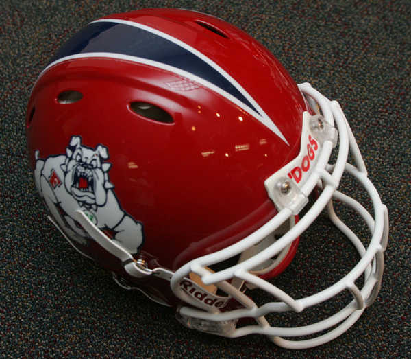
2011 Fresno State Bulldogs

2011
Fresno State Bulldogs
WAC


Helmet: A
Home Jersey: B
Away Jersey: A
Pants: B (red), A (white)

Final Verdict: 

Tweak 

I will be the first to admit that I did not like it when Fresno State changed from their previous uniform set to the current one. I thought it was crazy to change such a simple and classic design. However, I will admit that it looks better eight months later. The helmet itself did not change much, the strip was added, which I think gave it more color. The Fresno helmet was simple to begin with, this really didn't do much to hurt it. The pants are great, at least the white ones. They are similar to that of Arizona, in which they both have this digital tiling effect going on with the stripes. The whites are great, the reds, well, the problem is that the red and blue don't mix well, making the blue look like black. Same thing with the jerseys, the white is great, but the blue dose not look good on it. Whats really odd about these uniforms, is the "pit stains" under the sleeves. It seriously looks like, on the red uniforms, that someone sweat out that pattern. It is less offensive on the white uniforms, but on the blue it is a distraction. I am a bit upset that the "WAC" logo is mysteriously absent from the uniform and I hope that by next season the Mountain West will wise up and allow the conference patch to be in team colors and not the standard purple and silver. I think that if Fresno lightens up the blue and gets rid of... whatever you actually call that under the arms, and add TV numbers, the uniform would get a solid A.

(NOTE: I am aware that Fresno State will be in the Mountain West in 2012, but this uniform was made while they were in the WAC, thus it is reviewed under the WAC label.)

January 21, 2012

2012 Minnesota Golden Gophers

2012
Minnesota Golden Gophers 
B1G


Helmet: B-
Home Jersey: B (maroon), B (gold)
Away Jersey: B
Pants: A (all)

Final Verdict:

Tweak

So the new Golden Gopher uniforms are here, and frankly, I am unimpressed. Granted I really like the simple design they went with, but it may be too simple. First as stated in my review of the helmet, I don't like the black face mask. The face mask should be maroon or gold or possibly white (on a side note I did like the white helmet they had a few years ago), other than the that, the helmet is fine, but perhaps too dark. I do appreciate however that the rest of the uniform lacks any kind of black, except for the socks and shoes, bad move there. I have no problems with the pants, they are simple and have the proper team colors. The jerseys look decent, but a few flaws. First, I don't like "Minnesota" on the back, it should be on the front. I am a firm believe in player's names on the back of the uniforms, plus having just the logo on the front is pointless, as the logo is on the sides of the helmet. And I really hate the collar. Would someone please explain to me what that sticky, glazed looking this is on the front of the collar? I mean it looks like someone put a spider web on it or spilled something sticky on the jerseys. Every Nike team seems to be getting it and its really off putting and I hate it. I think that with a change of color on the face mask, putting "Minnesota" on the front of the jerseys, and perhaps some piping, it would get an "As Is" from me, but as it is, just a tweak grade.

For full pictures and video, visit this link:

January 17, 2012

SOPA Strike!

While I don't own Blogger, or any other website, I do support the SOPA Strike.

So if ANYONE is reading this (which I doubt at this point), please follow the link and support:

SOPA Strike!

December 22, 2011

2011 Wyoming Cowboys

2011
Wyoming Cowboys
Mountain West


Helmet: B+ (all helmets)
Home Jersey: B- (brown), C (yellow)
Away Jersey: B
Pants: A (brown), C (white), yellow (C)

Final Verdict:

Overhaul

Wyoming is kinda all over the place here. I know brown and yellow are hard colors to work with but, they could have done far better. The helmets are OK, they have the iconic cowboy logo that's plastered all over the state. The version with the Wyoming state flag is clever, the same can't be same for the "stars and strips" version. I appreciate that the brown jerseys have "Wyoming" spelled out, but why is Wyoming only abbreviated as "WYO" on the yellow jerseys? Plus, why are the designs two different designs? Shouldn't they be the same design with the colors inverted? And whats up with the Nike "Spirograph" design on the shoulders of the yellow jersey? The brown pants are great, some teams are now starting to write out the team names or mascots on the pants, which is kinda cool. The other pants however, again something bothers me about that strip. The problem is that there are too many combinations. While Maryland is the Oregon of the east coast, I guess Wyoming is the Oregon of the Rockies. Problem is that Wyoming is the weaker of the three simply because none of the designs looks like they go together, like they are made from different uniform sets instead of one cohesive set. I say keep the helmet(s) and go back to the drawing board for the rest of the uniforms.