Showing posts with label WAC. Show all posts

February 21, 2012

2001 San Jose State Spartans

2001
San Jose State Spartans
WAC


Helmet:  A-
Home Jersey: F
Away Jersey: B-
Pants: F (black), A (white)

Final Verdict:

Good Riddance

Welcome to my first "Retro Review". This is where I take a specific uniform set from the past and do a review of it. Since the uniform is typically no longer around, the gradeing scale is now: "Good Riddance" or "Should have left well enough alone". Basically the former meaning I am glad they got rid of it and the latter being they should have kept it.

I really feel bad for San Jose State sometimes. Not only are they the only FBS team in California with no respect, but they play in an area dominated by the Raider, 49ers, Golden Bears, and Cardinal, and continue to get buried each year. I just want to see these guys be competitive for once. Or at the very least, have good uniforms. This should be filed under the "what were they thinking" category. I think this is an early example of BFBS before it became popular. Not only does black consume the uniform as the symbiote consumed Peter Parker, but it makes the team look bush league. Lets start from the top. The helmet logo is great and a year before these uniforms they had their best helmet, with a yellow facemask. Here, however, its black and it really darkens the color of the helmet. The yellow numbers are OK, but what is that stripe they have? I can see it better on the away uniforms, but I can't tell what it is suppose to look like. At least the white uniform had an absents of black and looks rather decent. And whats up with the "S" and the "E" spelling both "San Jose" and "State"? I mean I like that they have it written there, and yes I understand that "San Jose State" can be a bit wordy for a uniform, but its just so weird, hard to focus your eyes kinda. I'll grant its unique, just not very good. Black pants? Nope. And really adding the blue and yellow stripes did not help. The only good thing about this uniform is that the away uniform looked good. Granted the strip on the side made no sense, but it look descent. I don't know what compelled SJSU to do this, but I am glad it didn't last long. But ever since this, it seems SJSU is still struggling to find a descent uniform. Its one thing to be a bad team or have a bad uniform, but both is just a crime.

February 6, 2012

2011 Idaho Vandals

2011
Idaho Vandals
WAC


Helmet: A- (standard), A- (alternate)
Home Jersey: A+
Away Jersey: B+
Pants: A+ (gold), A (black)

Final Verdict: 
As Is

This is the example to which Vanderbilt needs to look at for their uniforms. Idaho is a very simple black and gold. And frankly those two colors together look good, but teams like Vanderbilt can mess it up sometime, not in the the case of Idaho as a whole. The helmets are great. Simple with black face mask and gold shell. I gave it an A- simply because I am still a bit unsure about the logo. Same with the alternate. I don't think that Idaho has a unifying logo to put up there. Teams like Miami and Texas have an iconic logo that works on their helmets. Idaho tried two logos this year and neither really stand out as iconic, hence the minus. I will also note that I did not review the American flag logo, simply because it was a one time thing and nothing really special (American flag logos on helmets in general). Home jerseys, perfect. Sleeve numbers, "Idaho" on the front, gold numbers with white outlines, player names, and the "WAC" logo at a good size and it predominate. The away jerseys, that's another story. I mean I like the use of gold on the shoulders, but they don't match with the home jerseys. I don't like, nor understand, why they have two different uniform styles for the home and away. So it bothers me on that level. Plus, the "V" logo is on the collar for the away jerseys, but the "I" logo for the home. Someone needs to make up their mind here. And I also don't understand why the "WAC" logo has a box around it. Gold pants, perfect. Black pants? Well... I don't get the strip. Typically that stripe is used for teams that have a bear logo (like Cal or Baylor) to represent a bear paw slashing. Dose not work with Idaho, plus it dose not flow with the rest of the uniforms. I don't like the black on black, but its not as offensive as other black on black combos I have seen. Really, if they can tweak the white uniforms and maybe the black pants a bit it would be better, but I am satisfied with the uniforms as a whole and say that they should keep this as is.

January 22, 2012

2011 Fresno State Bulldogs

2011
Fresno State Bulldogs
WAC


Helmet: A
Home Jersey: B
Away Jersey: A
Pants: B (red), A (white)

Final Verdict: 

Tweak 

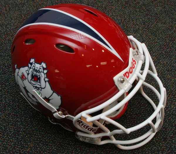
I will be the first to admit that I did not like it when Fresno State changed from their previous uniform set to the current one. I thought it was crazy to change such a simple and classic design. However, I will admit that it looks better eight months later. The helmet itself did not change much, the strip was added, which I think gave it more color. The Fresno helmet was simple to begin with, this really didn't do much to hurt it. The pants are great, at least the white ones. They are similar to that of Arizona, in which they both have this digital tiling effect going on with the stripes. The whites are great, the reds, well, the problem is that the red and blue don't mix well, making the blue look like black. Same thing with the jerseys, the white is great, but the blue dose not look good on it. Whats really odd about these uniforms, is the "pit stains" under the sleeves. It seriously looks like, on the red uniforms, that someone sweat out that pattern. It is less offensive on the white uniforms, but on the blue it is a distraction. I am a bit upset that the "WAC" logo is mysteriously absent from the uniform and I hope that by next season the Mountain West will wise up and allow the conference patch to be in team colors and not the standard purple and silver. I think that if Fresno lightens up the blue and gets rid of... whatever you actually call that under the arms, and add TV numbers, the uniform would get a solid A.

(NOTE: I am aware that Fresno State will be in the Mountain West in 2012, but this uniform was made while they were in the WAC, thus it is reviewed under the WAC label.)