2011
Fresno State Bulldogs
WAC

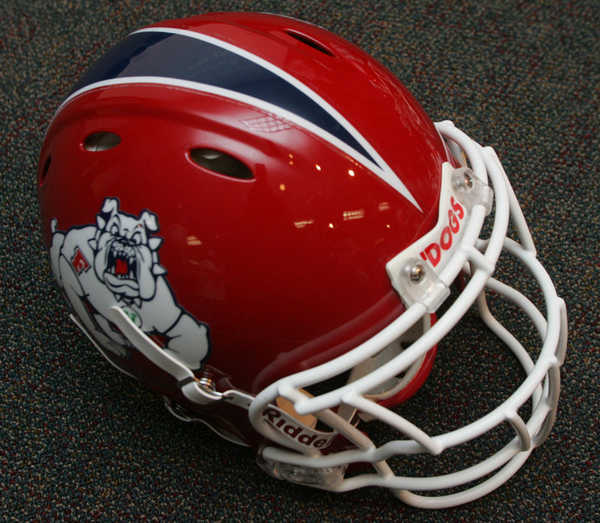


Helmet: A
Home Jersey: B
Away Jersey: A
Pants: B (red), A (white)
Final Verdict:
Tweak
I will be the first to admit that I did not like it when Fresno State changed from their previous uniform set to the current one. I thought it was crazy to change such a simple and classic design. However, I will admit that it looks better eight months later. The helmet itself did not change much, the strip was added, which I think gave it more color. The Fresno helmet was simple to begin with, this really didn't do much to hurt it. The pants are great, at least the white ones. They are similar to that of Arizona, in which they both have this digital tiling effect going on with the stripes. The whites are great, the reds, well, the problem is that the red and blue don't mix well, making the blue look like black. Same thing with the jerseys, the white is great, but the blue dose not look good on it. Whats really odd about these uniforms, is the "pit stains" under the sleeves. It seriously looks like, on the red uniforms, that someone sweat out that pattern. It is less offensive on the white uniforms, but on the blue it is a distraction. I am a bit upset that the "WAC" logo is mysteriously absent from the uniform and I hope that by next season the Mountain West will wise up and allow the conference patch to be in team colors and not the standard purple and silver. I think that if Fresno lightens up the blue and gets rid of... whatever you actually call that under the arms, and add TV numbers, the uniform would get a solid A.
(NOTE: I am aware that Fresno State will be in the Mountain West in 2012, but this uniform was made while they were in the WAC, thus it is reviewed under the WAC label.)
No comments:
Post a Comment